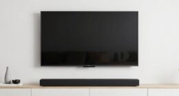
Your wall color can subtly influence how you perceive picture quality on screens because it affects the overall visual environment. Warm tones like beige create a cozy feel, while cool shades like blue can make images seem calmer but less sharp. The wall’s hue interacts with lighting and reflected colors, altering contrast and vibrancy. These factors can make details stand out more or less, impacting your viewing experience. If you keep exploring, you’ll discover how to optimize your space for the best picture quality.
Key Takeaways
- Wall color affects the background contrast, influencing how vibrant or muted on-screen images appear.
- Different wall hues reflect ambient light differently, altering perceived screen clarity and color accuracy.
- Warm or cool wall tones can subtly shift viewers’ perception of picture sharpness and detail.
- Lighting interactions with wall colors modify contrast levels, impacting overall image vibrancy.
- Room setup and wall color choice can enhance or diminish the visual impact of display content.
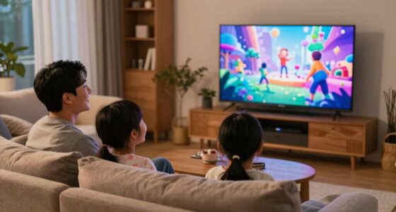
The color of your walls can considerably influence how you perceive the picture quality on your screen. When you sit down to watch a movie or play a game, the background hues subtly shape your visual experience. This isn’t just about aesthetics; it’s rooted in how our brains interpret color psychology and lighting effects. Your wall color acts as a backdrop that can either enhance or diminish the vibrancy of what’s displayed on your screen.
For example, if your walls are painted in warm tones like beige or soft yellow, they tend to create a cozy environment that can make images appear warmer and more inviting. Conversely, cooler shades like blue or gray can evoke a sense of calm but may also influence how sharp or crisp you perceive the picture. The key lies in how these hues interact with the light reflecting off your walls and screen. Lighting effects, such as ambient light and the room’s overall brightness, can either amplify or mute the colors on your display, altering your perception of clarity and contrast. Additionally, the lighting environment can significantly impact how colors are perceived, further emphasizing the importance of room setup. The lighting conditions in your space can also influence how your eyes adapt to different color temperatures, affecting overall picture perception. Moreover, color contrast between your walls and the screen can play a role in how well details stand out, impacting your viewing experience. External factors like ambient light levels can further modulate how vibrant or muted the picture appears, making it essential to consider your entire room lighting when optimizing your viewing setup. Recognizing the influence of visual perception can help you make informed choices about wall colors and lighting to enhance your viewing enjoyment.
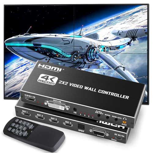
HDMl Video Wall Controller 2X2 with RS232, 4 TV Screens into 1 Wall Display, HDMI 4K 2X2 TV Wall Processor, 180° Rotate, Audio Extractor, 8 Splicing Modes1x1, 1×2, 1×3, 1×4, 2×1, 3×1, 4×1
✅ 【4K Video Wall Controller 2X2】 Combines multiple TVs into one large LED video wall by splitting a…
As an affiliate, we earn on qualifying purchases.
As an affiliate, we earn on qualifying purchases.
Frequently Asked Questions
Can Wall Color Affect the Perceived Brightness of a Picture?
Yes, wall color can affect how bright a picture appears. Light-colored walls reflect more ambient light, increasing lighting contrast and making images seem brighter. Darker walls absorb light, reducing reflections and creating a more subdued look. Your room’s wall hue influences perceived brightness by manipulating ambient reflections and contrast, so choosing the right color can enhance or diminish the picture’s visual impact depending on whether you want a vibrant or muted display.
Do Different Wall Colors Work Better With Specific Types of Artwork?
You’ll find that neutral backgrounds often make artwork pop, especially with vibrant pieces. Complementary hues work well together, enhancing contrast and making colors stand out. For example, a blue painting looks stunning against warm, earthy walls. Notably, studies show that 85% of viewers prefer artwork displayed on neutral backgrounds. So, choosing wall colors based on the artwork type helps you create a balanced, visually appealing display that highlights each piece’s unique qualities.
How Does Wall Color Influence the Color Accuracy of Displayed Images?
Your wall color affects how accurately displayed images appear by influencing ambient lighting and reflection. Light-colored walls reflect more light, which can brighten the room and enhance color perception, while darker walls absorb light, potentially dulling image colors. The wall material also plays a role; matte finishes reduce glare, preserving color fidelity, whereas glossy surfaces may cause reflections that distort image colors. Together, these factors shape your viewing experience and perceived picture quality.
Can Wall Paint Texture Impact Perceived Picture Quality?
Think of your wall paint texture as the canvas of a masterpiece. A matte finish absorbs light, reducing glare and softening images, while a glossy finish reflects more, making colors pop but potentially adding unwanted reflections. Wall paint finish influences perceived picture quality by affecting light diffusion. With wall color psychology, choosing the right texture can subtly enhance or diminish how your displayed images are perceived, creating the ideal viewing environment.
Are There Recommended Wall Colors for Optimizing Contrast in Photos?
You should choose neutral wall colors like soft grays, beiges, or muted blues to optimize contrast in photos. These colors minimize lighting effects and reduce color reflections that can distort your images. Color psychology suggests these shades create a calming backdrop that enhances subject focus. By selecting these tones, you’ll guarantee your photos have clearer contrast and better overall quality, making your images look more vibrant and professional.

Projector Screen Material Ambient Light Rejecting Fabric 69×118 inch for Max 130 inch 16:9 Projection Screen DIY, Black Backing 4K Ultra HD Front Projection EVA Polymer Material (Grey)
This is a new type of multi-layer composite EPPE polymer projection screen fabric, which is different from conventional…
As an affiliate, we earn on qualifying purchases.
As an affiliate, we earn on qualifying purchases.
Conclusion
So, next time you’re setting up your viewing space, remember that wall color can be the secret weapon in enhancing picture quality. It’s a small change that can make a big difference, turning a good experience into a great one. Don’t forget, sometimes it’s the little things that make all the difference. By paying attention to your walls, you’ll be surprised how much your viewing experience can improve—proving that it’s often the quiet changes that have the loudest impact.

LYTARA Dimmable Cordless Picture Light with Controller and Timer, Rechargeable 5000mAh Battery Wall Sconce for Wall Pictures, Gallery Artwork, Paintings, Portraits, Dartboards (Gold)
LYTARA Dimmable Cordless Picture Light: Illuminate your wall pictures, gallery artwork, paintings, portraits, and dartboards with our elegant…
As an affiliate, we earn on qualifying purchases.
As an affiliate, we earn on qualifying purchases.

Paint on Screen Projector Screen Paint with Ambient Light Rejection | UST Projector Screen Paint For Picture Perfect 1080 HD and 4K UHD Clarity in High Ambient Light Spaces | Matte Gray, 1 Gallon
TURN ANY SURFACE INTO A SCREEN: Transform any surface into a high-quality projection screen. This is the ideal…
As an affiliate, we earn on qualifying purchases.
As an affiliate, we earn on qualifying purchases.